"Colour! What a deep and mysterious language, the language of dreams.” - Paul Gauguin
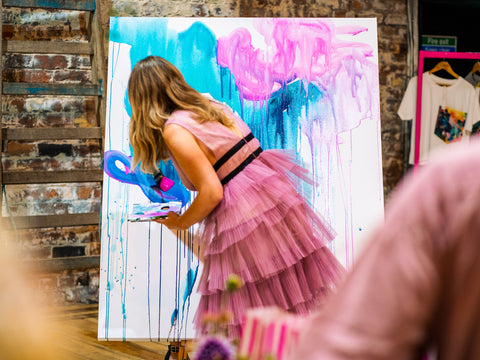
As many of you may already know, my background in colour science and colour theory plays an integral role in my art practice. From the way I interact with colour on a daily basis to how I intentionally utilise and manipulate colour within my paintings, I believe that colour is joy for the soul and want to share a little more about this fascinating subject with you!
On the surface, the concept of colour appears to be one of simplicity, after-all, it is something we have all been familiar with for most of our lives. In reality, colour perception is a broad and deep subject with many nuances and idiosyncrasies.
Colour is everywhere. The way we experience the world around us is enriched, energised, and reinforced by colour and its many functions. Colour can be a vital communication tool within our society, often helping us to stay safe and make informed decisions. Think about how colour affects your everyday life; from traffic lights and stop signs to product differentiation (I’d buy the pink toothbrush over the green one any day!) and brand recognition (can anyone else spot the golden arches from miles away?). Colour literally informs and guides us within seconds. It can also provide us with beauty and pleasure in the form of sunsets, home furnishings and (you guessed it!) fine art paintings.
Considering colour plays such a vital role within our lives, it is very surprising that there is a general lack of understanding surrounding the subject of colour itself. What is colour? How do we see colour? What on earth is hue? Am I right in thinking you’ve pondered these questions so many times without receiving answers? Well, keep scrolling to immerse yourself in the world of colour – and get ready to think like an artist!
What is colour?
Put simply, (or perhaps not so simply…my bad!) colour describes the sensation we feel when cells (called rods and cones) within our eyes perceive visible light wavelengths of specific frequencies. For example, when we are looking at a red apple, visible light wavelengths of approximately 650nm-700nm are reflected off the surface of the apple and into our eyes where they are perceived by the rods and cones, providing the sensation of ‘red’ within us. Colour is not in fact a physical property of an object, but more a sensation conjured within our minds when exposed to wavelengths between 380nm – 700nm.
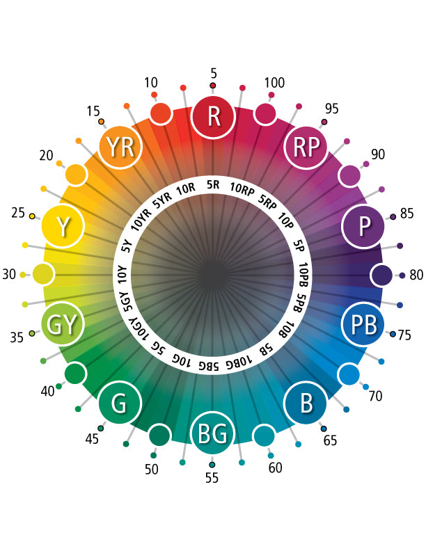
So now we understand what colour is, we can dive deeper into what we actually see. Colour as we know it consists of three main variables; hue, chroma and value;
What is hue?
Hue simply describes a colour’s position in the colour wheel or in other words, the dominant wavelength of a particular colour. Green, blue, yellow, red and purple are all examples of hues.
What is chroma?
Chroma is simply the saturation (intensity) of a hue.
"Chroma is the departure degree of a colour from the neutral colour of the same value. Colours of low chroma are sometimes called “weak,” while those of high chroma are said to be “highly saturated,” “strong,” or “vivid.” – Munsell, 2022
What is Value?
Value simply refers to the lightness of a colour. In other words, how much white or black is prominent within a colour. If you want to understand this a little deeper, head to https://munsell.com/about-munsell-color/how-color-notation-works/
Okay, so now we understand colour perception and hue… but how does this impact your art practice?
Colour Meaning
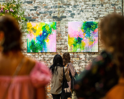
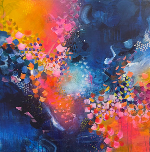
My favourite thing about colour is that it can be used to express thoughts, feelings, and emotions when words simply can’t. Over the years there's been lots of academic research into the subject of ‘colour meaning’ and how different hues have different physiological effects on individuals. Below, I have summarised the most-widely accepted colour meanings for each hue. (Of course, these vary greatly between cultures and countries, further resources have been included where relevant so you can find out more for yourself) It is important to understand that personal experience and context also play a huge role, and this should also be acknowledged. I've gathered relevant imagery to further illustrate the colour meanings... I’d love to know the feeling each hue evokes in you! Pop your thoughts in the comments below.
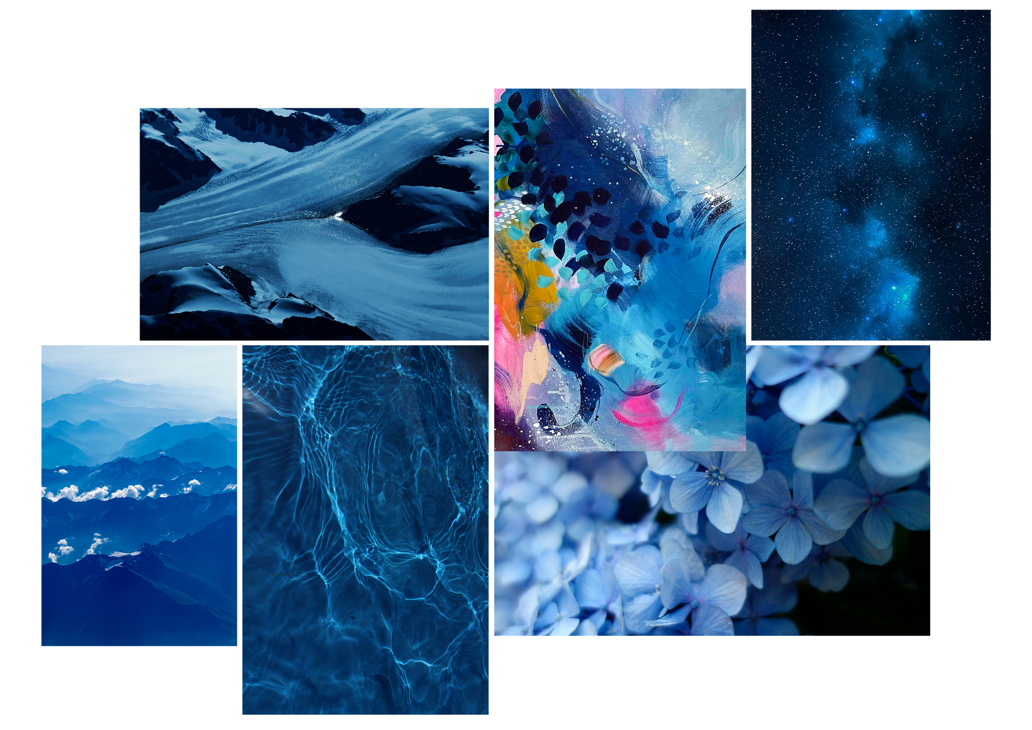
Blue
Blue is a calming and peaceful colour – think about blue skies, tranquil seas, and clear blue lakes. So much of colour meaning links back to reference points and memories such as these. It’s no wonder when we see the colour blue we’re reminded of these tranquilities! Of course, a blue hue can vary greatly in terms of value and chroma; these nuances lead to different physiological responses. For example, a dark, rich navy blue can evoke feelings of moodiness and drama whilst a pastel blue can conjure feelings of safety and reliability. Thinking about these connotations whilst choosing your next colour palette or making your next move on a painting is sure to have an impact on the emotional outcome of your work!
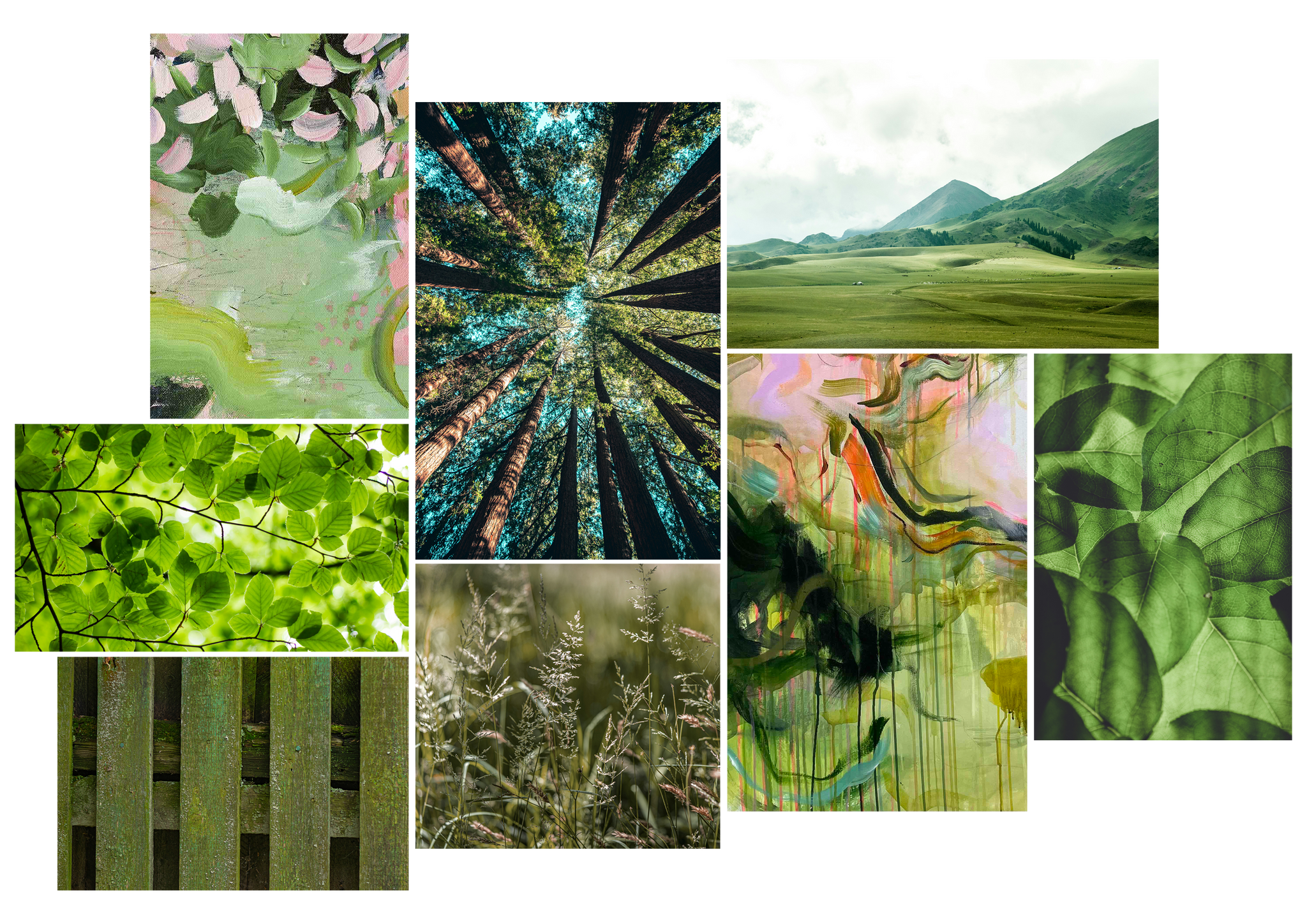
Green
With obvious links to nature and the environment, similarly to blue, green can have a very calming and peaceful effect on us. Evoking memories of luscious greenery, forests, fields and fresh vegetables, green can also be a very grounding colour that takes your mind back to the basics of life! On the other hand, green is also traditionally said to be the colour of envy and jealousy. In some cultures, it also represents luck.
Yellow
The colour of the sun, it's no surprise that yellow evokes feelings of happiness, positivity and vitality! Using yellow in small proportions within paintings can have a profound impact and it contrasts with adjacent hues that are much less vibrant and saturated. An invigorating and energising colour, it can be very marmite! Making a decision about whether you want to use yellow as a pop of energy within a painting or you want to go all out with large swathes of golden will have a direct impact on the viewer's visceral reaction to your artwork.

Red
In a prehistoric sense, red was the colour of blood, fire and raw meat; therefore acting as a warning of immediate danger. It's no surprise that the colour is now synonymous with violence, passion and anger. However, when referring to colour meaning it's so important to bring context into the mix! A punnet of fresh strawberries or autumn leaves bring feelings of vitality and energy. Red has so many different colour meanings which highlights the importance of careful consideration of its use is within the context of art and design.

Further Resources and References:
The Secret Lives of Colour, Kassia St Clair
Colour Psychology Today, June McLeod
The Secret Language of Color, Joann Ecksut & Arielle Eckstut